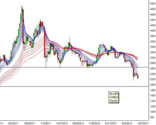
The most important feature of the weekly silver chart is the way it moves in advance of the gold chart. The behavior in silver has led the behavior in gold for more than 18 months. Silver's fall below the critical long term support level near $26.50 an ounce gave early warning of the recent collapse in gold. (Note chart scale is shown in cents)
There are two key features on the silver chart. The first feature is the relationship in the Guppy Multiple Moving Averages indicator. They show a well established downtrend. The short term group of average reflects the behavior of traders. The wide separation shows traders are sellers. They are short on silver. The long term group of averages shows the behavior of investors. They are also sellers, as shown by the separation in the long term GMMA. The conclusion is that this is a downtrend that has a lower probability of developing a sustainable reversal.
(Read More: Silver Higher After Wild Ride )
So the important question to answer is to decide how low silver may fall. The answer is given by the long term historical support level near $19.40. This support level acted as resistance level in December 2009 and again in May 2010 and July 2010. The breakout above this level in September 2011 developed into a powerful new uptrend that reached the highs near $49.60 in April 2011.